DrayEasy
BACKGROUND
DrayEasy combines real-time quotes, top-tier drayage services, shipment tracking, and seamless API integration, all in one efficient platform.
OBJECTIVES
Our project is dedicated to developing the DrayEasy mobile app from the ground up, focusing on key features like the order list, draft order, notification, and message system.
TIMELINE
June 2023 - September 2023
ROLE
TEAM
CONTRIBUTION
TOOLS
Ideation
User Research
Wireframing
UI Design
Figma
Adobe Photoshop
Adobe Illustrator
Walter Zhou, Project Manager
Bing Liu, Design Lead
Jialiang Ye
Kathy She
UX Researcher
UX Designer
Prototyper
Illustrator
01 | OVERVIEW
1.1 | CONTEXT
DrayEasy is a 2B-faced logistics platform that provides instant quote, container tracking, and drayage coverage. The service focuses on covering transportation of shipping containers over short distances.
With the web version already in place, DrayEasy needed an app version so users (brokers) can track orders on the go. Due to the restrictions between systems, map tracking and online payment were not allowed. We focused on developing the three following features:
Feature 01
Order List Display
Feature 02
Draft Order Display
Feature 03
Notification Details
https://www.drayeasy.com/
1.2 | SOLUTION
An integrated mobile application that provides easy access to orders, quotes, and notifications.
Order List & Draft Orders
Efficiently determine the release status of orders with color-coded indicators
Advanced filtering and sorting tools for smooth navigation and management of orders.
Draft orders navigation and detailed views
Notification Types
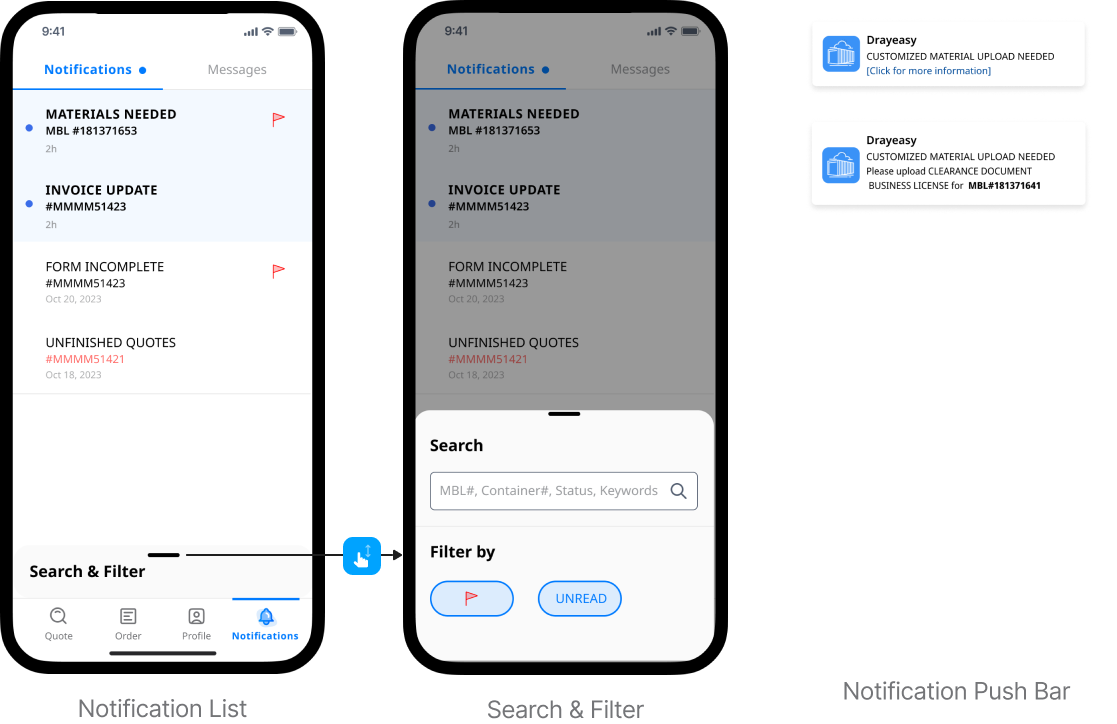
Search and filter through notification list
Notification type I: unfinished quotes
Notification type II: missing information
Notification type III: delays and errors
02 | RESEARCH
2.1 | THE PROCESS
We began by analyzing the current process users go through when booking an order via the online portal.
2.2 | USER PERSONAS
The user persona was created based on market research and analysis. It helps our team understand the needs, experiences, behaviors, and goals of the users.
2.3 | USER JOURNEY
Main takeaways from the mapping the journey:
Order placement should be hierarchical and clearly shows the status (on-hold, in-transit, delivered).
Easy to view and sort orders, as well as access the history.
Needs features to have a portal for anticipating potential delays or issues and addressing them preemptively.
Easily navigate through different functionalities such as order searching, status updates, and payment processing.
03 | IDEATION
3.1 | BRAINSTORM
In conjunction with analyzing insights from persona and journey map, we examined other mobile logistics platform on the market such as Uber freight, Flexport, and distilled essential elements for our competitive strategy:
3.2 | USER FLOW
Combining the insights with the three main features we want to develop, we designed the user flow:
3.3 | WIREFRAME & USABILITY TESTING
Order List Iteration: We iterated our design after multiple rounds of feedback from client and actual users
Iteration 1
Card style is inefficient for limited mobile space
Using a bottom sheet for draft orders is inefficient as there's no back-and-forth between draft and my orders.
Iteration 2
Too much info in text on
Too many colors on the
User use city name instead of MBL# for browsing
Order List: Winner!
Highlight IR city and destination city for easy scanning by casual browsers.
Color-highlight the release status.
Ensure ample white space for clearer information hierarchy.
Draft List Iteration: We iterated our design after multiple rounds of feedback from client and actual users
Iteration 1
The “greeting” is taking up too much valuable real estate on the screen
List card is too big, prioritize showing more orders in one screen
Iteration 2
Filter bar is not necessary for users when creating unfinished quotes and can be removed
Client specified that no more than five draft orders to be displayed at once
Draft Orders: Winner!
Color-coded labels to indicate status of draft orders
Cleaner card layout better readability
Crossing and fading out expired label for differentiation
Notification Iteration: We iterated our design after multiple rounds of feedback from client and actual users
Iteration 1
Unnecessary to show order status at Notification, let alone some instructions do not connect to an order yet.
Too many color distract users from the important notification content
Notification: Winner!
Delete order status from the design for readability
Add “flag” sign to show importance
04 | FINAL DESIGN
4.1 | FINAL DESIGN
The project is dedicated to developing the DrayEasy mobile app from the ground up, it is a strategic shift from B2B web to mobile. The focus was to design key features like the order list, draft order, notification, and message system.
FEATURE 1
Order List:
Enables users to swiftly ascertain an order's release status at a glance through color-highlighted indicators.
Offers efficient and detailed filtering and sorting capabilities, aiding users in quickly locating specific orders.
Quick Action:
With a simple left swipe on the order list, users can instantly access the 'hold' action button to pause deliveries, eliminating the need to delve into further details.
FEATURE 2
Draft Order:
Displays the status of draft orders (Editable, Expiring Soon, Expired).
Provides a detailed view of each draft order.
Offers a comprehensive breakdown of charges associated with each draft order.
FEATURE 3
Notifications:
On the Notification Screen, Unread notifications are shown with blue dots and unread notifications are shown with bold fonts. Users can flag important information, and swipe up for deleting notifications.
In Search & Filter feature, users can search by keywords or filter by “Flagged” and “Unread” category.
Push bars show highlighted informations of new notifications.
Notification Details:
Notification content includes the following:
Upload custom materials
Delay due to weather condition Please submit pick-up number
Unfinished quotes expiration date
05 | REFLECTION & NEXT STEP
Information Management on Mobile
The logistic service of DrayEasy contains a lot of text information that needs to be displayed. Due to platform restriction, the text-heavy information cannot be replaced via a visual map. The mobile app's vertical design can make web content overwhelming; thus, creating a hierarchical layout and segmenting pages is key for clear, efficient information display.
Web to Mobile Transition
Moving a product from web to mobile is complex. It requires considering business models, user behavior, and platform-specific aspects. I learned that it is important to capture user requirements and behaviors more specific to the group of drayage users. The mobile version not only need to complement the web version, but also reduce the cognitive load of users for ease of use on-the-go.


